Showing posts with label statistics. Show all posts

Tuesday, May 13, 2025

Notes on DEseq2 design

My note from today's lab meeting:

  1. For senario like Rambo's project, where in a case-control two group comparison, each subject has multiple repeats (or multiple time points). To test the genes associated with the condition, you must model subject as a blocking factor (random effect) to properly control for within-subject correlations. DEseq2 does not take random effect directly, so we typically use linear mixed effect model from other packages like voom or dream in variancePartition for such data. Here is the correct design to linear mixed effect model wehre subjectID is a random effect:  design <- ~ group * time + age + sex + (1|subject_id) (Please note that group * time part is same as group + time + group:time where group:time is the interaction term.)
    1. If you still want to use DESeq2 (limited option), you can collapse the repeated measures by treating subject_id as a fixed effect (only works if subjects are not too many), e.g. design = ~ subjectID + age + sex + group. For case where you have many subject (e.g. usually n>20), you don't want to do that as each subjectID will become a dummy variable and it will be very computationally expensive to calculate coefficiency.
    2. Another way to test the interaction term in DEseq2 (or other similar framework) is to use LRT (likelihood ratio test) between two designs: e.g. full mode design = ~ subject_id + time + group + group:time and reduce mode as ~ subject_id + time + group , then in DEseq2, you can call function like  dds <- DESeq(dds, test="LRT", reduced = ~ subject_id + time + group) to get the genes with expression changes over time differ between groups (aka: progression-associated genes).
  2. For senario like Himanshu's project, where each subject has a paired condition (e.g. before and after drug treatment, or neuroma and paired non-neuroma tissue). To test the genes associated with the condition, you can simply include the subjectID as a covariate e.g. design = ~ subjectID + age + sex + condition.

Monday, November 22, 2021

EASE vs. Fisher's exact test

EASE is a modified version of Fisher's exact test. It's used in DAVID. We are often asked about their difference. Here is. 

From DAVID website: https://david.ncifcrf.gov/content.jsp?file=functional_annotation.html

A Hypothetical Example 

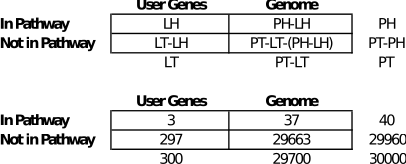
In the human genome background (30,000 genes total; Population Total (PT)), 40 genes are involved in the p53 signaling pathway (Population Hits (PH)). A given gene list has found that three genes (List Hits (LH)) out of 300 total genes in the list (List Total (LT)) belong to the p53 signaling pathway. Then we ask the question if 3/300 is more than random chance compared to the human background of 40/30000

A 2 x 2 contingency table is built based on the above numbers: 

List Hits (LH) = 3 
List Total (LT) = 300 
Population Hits (PH) = 40 
Population Total (PT) = 30,000


Exact p-value = 0.007. Since p-value < 0.05, this user's gene list is specifically associated (enriched) in the p53 signaling pathway by more than random chance. 

What about the EASE Score 
The EASE Score is more conservative by subtracting one gene from the List Hits (LH) as seen below. If LH = 1 (only one gene in the user's list annotated to the term), EASE Score is automatically set to 1.


For our hypothetical example involving the p53 signaling pathway, the EASE Score is more conservative with a p-value = 0.06 (using 3-1 instead of 3). Since the p-value > 0.05, this user's gene list is not considered specifically associated (enriched) in the p53 signaling pathway any more than by random chance.

From https://www.ncbi.nlm.nih.gov/pmc/articles/PMC328459/:

The EASE score is offered as a conservative adjustment to the Fisher exact probability that weights significance in favor of themes supported by more genes. The theoretical basis of the EASE score lies in the concept of jackknifing a probability. The stability of any given statistic can be ascertained by a procedure called jackknifing, in which a single data point is removed and the statistic is recalculated many times to give a distribution of probabilities that is broad if the result is highly variable and tight if the result is robust [9]. The EASE score is calculated by penalizing (removing) one gene within the given category from the list and calculating the resulting Fisher exact probability for that category. It therefore represents the upper bound of the distribution of jackknife Fisher exact probabilities and has advantages in terms of penalizing the significance of categories supported by few genes. For example, assume a list of 206 genes is selected from a population of 13,679 genes. If there is only one gene in the population in some rare category, X, and that gene happens to appear on the list of 206 genes, the Fisher exact would consider category X significant (p = 0.0152). At the same time, the Fisher exact probability would deem a more common category, Y, with 787 members in the population and 20 members on the list, as slightly less significant (p = 0.0154). From the perspective of global biological themes, however, a theme based on the presence of a single gene is neither global nor stable and is rarely interesting. If the single gene happens to be a false positive, then the significance of the dependent theme is entirely false. However, the EASE score for these two situations is p = 1 for category X and p < 0.0274 for category Y, and thus the EASE score eliminates the significance of the 'unstable' category X while only slightly penalizing the significance of the more global theme Y. By extrapolating between these two extremes, the EASE score penalizes the significance of categories supported by fewer genes and thus favors more robust categories than the Fisher exact probability.

Saturday, July 03, 2021

Note (2) for DESeq2 time series data analysis

More notes on using LRT to test time-series data. Thanks for the discussion with Jie. 
  1. swapping the levels of time factor won't change the LRT results, as if the time variable is a factor, LRT won't see it as a trajectory analysis but rather a factor analysis (e.g. condition-specific difference at ANY time point). 
  2. subsetting only two time points {t0, ti} in LRT will get different numbers of DE genes at different time point i.  See example below; when only testing the {0, 60} minutes, 7 DE genes found. If including all time points in LRT, it will only find 4 DE genes. This could be the case that the likelihood ratio gets smaller when including time points with no or smaller condition-specific difference. Another possibility this may be happening is that there is a large dependence on t2 independent of the condition. When you add t2, you are adding it in the variable “time” to both the numerator and denominator of the LRT, and that may result in a smaller ratio.
  3. converting the time covariate from a factor / categorical variable to a continuous variable can get different results. The categorical variable in LRT does not consider the slope or trajectory nature, but it can detect genes that contribute a big condition-specific difference at a specific time point while the overall slope may not change. A continuous variable can consider the slope change or trajectory analysis. It's more like a time-series analysis.  Sometimes we may need to do both. 

Monday, April 19, 2021

Note for DEseq2 time course analysis

In many cases, we need to perform differential expression across the time course data, e.g. finding genes that react in a condition-specific manner over time, compared to a set of baseline samples. DEseq2 has such an implementation for time-course experiments

There are a number of ways to analyze time-series experiments, depending on the biological question of interest. In order to test for any differences over multiple time points, once can use a design including the time factor, and then test using the likelihood ratio test as described in the following section, where the time factor is removed in the reduced formula. For a control and treatment time series, one can use a design formula containing the condition factor, the time factor, and the interaction of the two. In this case, using the likelihood ratio test with a reduced model which does not contain the interaction terms will test whether the condition induces a change in gene expression at any time point after the reference level time point (time 0). An example of the later analysis is provided in our RNA-seq workflow.

Below is the example in DEseq workflow using LRT to test the interaction term (e.g. any condition-specific changes at any timepoints after time 0):

http://master.bioconductor.org/packages/release/workflows/vignettes/rnaseqGene/inst/doc/rnaseqGene.html#time-course-experiments

library("fission") data("fission") ddsTC <- DESeqDataSet(fission, ~ strain + minute + strain:minute)

ddsTC <- DESeq(ddsTC, test="LRT", reduced = ~ strain + minute) resTC <- results(ddsTC)

Several notes from the DEseq2 forum:

  1. By default, the result() function will return the LRT test p-value and MLE log2FC for the difference between Mut vs WT at the last timepoints, controlling for baseline
  2. To get the log2FC for the difference between Mut vs WT at a different timepoint, you have to manually specify it, e.g. "strainmut.minute15" is the difference between Mut vs WT at minute 15, controlling for baseline. 
  3. To generate the tables of log2 fold change of 60 minutes vs 0 minutes for the WT strain would be results(dds, name="minute_60_vs_0"); 
  4. To generate the tables of log2 fold change of 60 minutes vs 0 minutes for the mut strain would be the sum of the WT term above and the interaction term which is an additional effect beyond the effect for the reference level (WT): results(dds, contrast=list(c("minute_60_vs_0","strainmut.minute60"))
  5. "strainmut.minute15" is the difference between Mut vs WT at minute 15, controlling for baseline. If you add "strain_mut_vs_wt" to this, you get the LFC for Mutant vs WT at minute 15, not controlling for baseline. So the second one is the observed difference at minute 15 between the two groups (because you added in the change that was present at time=0).

Two kinds of hypothesis tests in DEseq2:

Wald test: to test if the estimated standard error of a log2 fold change is equal to zero

LRT (likelihood ratio test) between a full model and a reduced model: to test if the increased likelihood of the data using the extra terms in the full model is more than expected if those extra terms are truly zero.


Tuesday, January 12, 2016

Calculate the odd of winning Powerball in R

This Wednesday’s Powerball grand prize already climbed up to $1.5 BILLION. If you choose to cash out, it would be $930 million. And it keeps increasing…
So, what’s the odd of winning the jackpot prize?
Here is the game rule according to Powerball.com:

…we draw five white balls out of a drum with 69 balls and one red ball
out of a drum with 26 red balls.

We can calculate the total number of different combinations in R:

> choose(69,5)*26
[1] 292201338

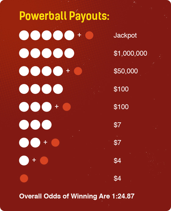
If we are super super lucky to win the Jackpot of $930 million cash value, given that we have to pay 39.6% as federal tax, how much we expect to return for a $2 investment? (Of course, everyone expect to win the $1.5 billion jackpot)

> 930e6*(1-0.396)/(choose(69,5)*26)
[1] 1.92

Actually it’s not a good investment. (Thanks for the comment below. I made a mistake; 930million should be 930e6, not 930e9).
If we want to be 100% guaranteed, we have to buy all 292 million combinations. In that case, can we earn?
enter image description here

# this is what we pay
> choose(69,5)*26*2
[1] 584,402,676

# this is what we earn in total, before tax
> 930000000 + 1000000*choose(25,1) + 50000*choose(5,4)*choose(69-5,1) + 100*choose(5,4)*choose(69-5,1)*choose(25,1) + 100*choose(5,3)*choose(69-5,2) + 7*choose(5,3)*choose(69-5,2)*choose(25,1) + 7*choose(5,2)*choose(69-5,3) + 4*choose(5,1)*choose(69-5,4) + 4*choose(69-5,5)
[1] 1,023,466,048

# Nearly $5 billion!!! Then we need to pay 40% of tax. Maybe not for the minor prize, let's simplify it for all.
> 1023466048 * (1-0.396)
[1] 618,173,493

That’s still more than what we paid. Why don’t we do that?
Remember, people share the prize if multiple persons got the same winning number, which we don’t know. :D

Just some fun! :)


References:
1. Fascinating Math Behind Why You Won’t Win Powerball
(http://www.wired.com/2016/01/the-fascinating-math-behind-why-you-wont-win-powerball/)
2. Tax for lottery (http://classroom.synonym.com/much-federal-taxes-held-lottery-winnings-20644.html)

Friday, December 04, 2015

My note on multiple testing

It's not a shame to put a note on something (probably) everyone knows and you thought you know but actually you are not 100% sure. Multiple testing is such a piece in my knowledge map.

Some terms first:
- Type I error (false positive) and Type II error (false negative): 
When we do a hypothesis test, we can categorize the result into the following 2x2 table:
 Table of error types Null hypothesis (H0) is
Valid/TrueInvalid/False
Judgement of Null Hypothesis (H0)RejectType I error
(False Positive)
Correct inference
(True Positive)
Fail to rejectCorrect inference
(True Negative)
Type II error
(False Negative)
Type I error is "you reject a true thing". If the true thing is a null hypothesis (H0), which is what people usually assume (e.g. no difference, no effect), then you reject it (or yes, there is difference), it's like a false positive. The similar logics for Type II error, or false negative.

Also note that people use Greek letter α for type I error rate and β for type II error rate. α is also the significant level for a test, e.g. 5%. So when a single test reaches p-value 0.05, we can intuitively understand that with 5% of chance we make a mistake or 5% of cases we thought significant are actually not. β is related with the power of a test. Power of a test = the ability to detect True Positive among all real positive cases.

- Sensitivity and Specificity
 Total test (m)Null hypothesis (H0) is
Valid/TrueInvalid/False
Judgement of Null Hypothesis (H0)Reject (R)VS
Fail to rejectUT
Sensitivity = S / (S+T)  = power = 1-β
Specificity = U / (U+V) = 1-α

- Why multiple testing matters?
It matters because we usually perform the same hypothesis tests not just once, but many many times. If your chance of making an error in single test is α, then your chance to make one or more errors in m tests will be
Pr(at least one error)=1−(1−α)m
So, then m is large, the chance will be nearly 100%. That's why we need to adjust the p-values for the number of hypothesis tests performed, or to control type I error rate.

- How to control type I error rate in multiple test?
There are many different ways to control the type I errors, such as
Per comparison error rate (PCER): the expected value of the number of Type I errors over the number of hypotheses, PCER = E(V)/m
Per-family error rate (PFER): the expected number of Type I errors, PFE = E(V).
Family-wise error rate (FWER): the probability of at least one type I error, FWER = P(V ≥ 1)
False discovery rate (FDR) is the expected proportion of Type I errors among the rejected hypotheses, FDR = E(V/R | R>0)P(R>0)
Positive false discovery rate (pFDR): the rate that discoveries are false, pFDR = E(V/R | R > 0)

- Controlling Family-Wise Error Rate
Many procedures have been developed to control the family-wise error rate P(V≥ 1), including the Bonferroni, Holm (1979), Hochberg (1988), and Sidak. It consists of two typessingle-step (e.g. Bonferroni) and sequential adjustment (e.g. Holm or Hochberg). Bonferroni correction is to control the overall type I errors when all tests are independent. It rejects any hypothesis with p-value ≤ α/m. So, when doing corrections, simply multiply the nominal p-value by m to get the adjusted p-values. In R, it's the following function
p.adjust(p, method = "bonferroni")
The sequential corrections is slightly more powerful than Bonferroni test. The Holm step-down procedure is the easiest to understand. First, sort your thousand p-values from low to high. Multiply the smallest p-value by one thousand. If that adjusted p-value is less than 0.05, then that gene shows evidence of differential expression. There is no difference as Bonferroni test for the gene. Then for the 2nd one, multiply its p-value by 999 (not one thousand) and see if it is less than 0.05. Multiply the third smallest p-value by 998, the fourth smallest by 997, etc. Compare each of these adjusted p-values to 0.05. We then insure that any adjusted p-value is at least as large as any preceding adjusted p-value. If it is not make sure it is equal to the largest of the preceding p-values. This is the algorithm of Holm step-down procedure. In R, it's
p.adjust(p, method = "holm")

- Controlling FDR
FWER is appropriate when you want to guard against ANY false positives. However, in many cases (particularly in genomics) we can live with a certain number of false positives. In these cases, the more relevant quantity to control is the false discovery rate (FDR). False discovery rate (FDR) is designed to control the proportion of false positives (V) among the set of rejected hypotheses (R). The FDR control has generated a lot of interest due to its more balanced trade-off between error rate control and power than the traditional Family-wise Error Rate control

Procedures controlling FDR include Benjamini & Hochberg (1995), Benjamini & Yekutieli (2001), Benjamini & Hochberg (2000) and two-stage Benjamini & Hochberg (2006).

Here are the steps for Benjamini & Hochberg FDR:
1. sort nominal p-values from small to big: p1 ≤ p2 ≤ … ≤ pm
2. find a highest rank of j with pj < (j/m) x δ, where δ is the controlled FDR level. 
3. declare the tests of rank 1, 2, …, j as significant, and their adjusted p-values as pj*m/j. 

Reference:
http://www.r-bloggers.com/adjustment-for-multiple-comparison-tests-with-r-resources-on-the-web/
http://www.gs.washington.edu/academics/courses/akey/56008/lecture/lecture10.pdf
http://www.stat.berkeley.edu/~mgoldman/Section0402.pdf

Sunday, August 16, 2015

Using ANOVA to get correlation between categorical and continuous variables

How to calculate the correlation between categorical variables and continuous variables?

This is the question I was facing when attempting to check the correlation of PEER inferred factors vs. known covariates (e.g. batch).

One solution I found is, I can use ANOVA to calculate the R-square between categorical input and continuous output.

Here is my R code snip:

## correlation of inferred factors vs. known factors
# name PEER factors
colnames(factors)=paste0("PEER_top_factor_",1:bestK)
# continuous known covariates:
covs2=subset(covs, select=c(RIN, PMI, Age));
# re-generate batch categorical variable from individual binary indicators (required by PEER)
covs2=cbind(covs2, batch=paste0("batch",apply(covs[,1:6],1,which.max)))
covs2=cbind(covs2, Sex=ifelse(covs$Sex,"M","F"), readLength=ifelse(covs$readsLength_75nt, "75nt", "50nt"))

library("plyr")
# ref: http://stackoverflow.com/a/11421267
xvars=covs2; yvars=as.data.frame(factors);
r2 <- laply(xvars, function(x) {
  laply(yvars, function(y) {
    summary.lm(aov(y~x))$r.squared
  })
})
rownames(r2) <- colnames(xvars)
colnames(r2) <- colnames(yvars)

pvalue <- laply(xvars, function(x) {
  laply(yvars, function(y) {
    anova(lm(y~x))$`Pr(>F)`[1]
  })
})
rownames(pvalue) <- colnames(xvars)
colnames(pvalue) <- colnames(yvars)

require(pheatmap);
pheatmap(-log10(t(pvalue)),color= colorRampPalette(c("white", "blue"))(10), cluster_row =F, cluster_col=F, display_numbers=as.matrix(t(round(r2,2))), filename="peer.factor.correlation.pdf")

I highlighted the core part in yellow color. As it shows, we can use aov() function in R to run ANOVA. Its result can be summarized with summary.lm() function, which show output like:

> summary.lm(results)

Call:
aov(formula = weight ~ group)

Residuals:
    Min      1Q  Median      3Q     Max 
-1.0710 -0.4180 -0.0060  0.2627  1.3690 

Coefficients:
            Estimate Std. Error t value Pr(>|t|)
(Intercept)   5.0320     0.1971  25.527   <2e-16
grouptrt1    -0.3710     0.2788  -1.331   0.1944
grouptrt2     0.4940     0.2788   1.772   0.0877

Residual standard error: 0.6234 on 27 degrees of freedom
Multiple R-squared: 0.2641,     Adjusted R-squared: 0.2096 
F-statistic: 4.846 on 2 and 27 DF,  p-value: 0.01591

R^2 and p-value are shown at the end of output.

Note: the summary.lm() object doesn't contain value of p-value directly. But we can compute p-value in command like:

> F=summary.lm(results)$fstatistic
> F=as.numeric(F)
> pf(F[1],F[2],F[3])

Below table is a nice summary the methods applicable to corresponding data type.

PREDICTOR VARIABLE (S)
OUTCOME VARIABLE
CategoricalContinuous
CategoricalChi Square, Log linear, Logistict-test, ANOVA (Analysis of Varirance)Linear regression
ContinuousLogistic regressionLinear regression,  Pearson correlation
Mixture of Categorical and ContinuousLogistic regressionLinear regressionAnalysis of Covariance
Ref:http://www.tulane.edu/~panda2/Analysis2/sidebar/stats.htm

Next thing I need to refresh my mind is how different in calculating the correlation using cor() and the above ANOVA method above.

I know the correlation coefficient r can be inferred from the coefficient and sd of two variables. For example, we know sd(x) and sd(y), then when regressing y~x, we got regression line e.g. y=b0 + b1x. Then we can calculate r as

r = b1 * SDx / SDy

When x and y are in standard normal distribution, e.g. u=0, sd=1, then r=b1.
https://people.richland.edu/james/ictcm/2004/weight.html
http://ww2.coastal.edu/kingw/statistics/R-tutorials/oneway.html

Thursday, August 08, 2013

How to select MACS peaks based on p-value, fold_enrichment and FDR?

In the output peaks.xls file from MACS(v1.4), there are 3 columns: -10log10(pvalue), fold_enrichment, and FDR(%). We can use these three columns to sort/filter peaks. Here are what they means:
The '−10*log10(Pvalue)' column lists the transformed P value of each peak, which makes peak sorting easier. For example, a P value of 1e−5 would be transformed to 50. The 'fold_enrichment' column shows the ratio of the ChIP-seq read count to the local value of lambda within each peak. The 'FDR(%)' column contains the empirical FDR percentage for each peak. For example, the fourth peak in the list has an 'FDR(%)' value of '6.45' and '−10*log10(Pvalue)' value of '83.67'; using the same P value cutoff of 4.4e−09 = 1083.67/−10, the ratio of the number of peaks identified by MACS after and before exchanging control and ChIP-seq samples is 6.45:100. The FDR column is only available when the control sample is available.
As the MACS paper (Zhang et al., Genome Biology, 2008) clearly stated, MACS uses Poisson distribution to measure the distribution of ChIP-seq tag. Poisson distribution is characterized as having only one parameter, λ, for both mean and variance. The origin of using Poisson distribution to measure ChIPseq tag can be referred to a Nature paper (see its supplementary note):
The number of sequence reads required to map a chromatin feature can be estimated from a simple model.
Suppose that the genome is divided into N non-overlapping bins of fixed size, that a fraction of these bins contain a particular chromatin feature and that one performs ChIP-Seq with an antibody that enriches the sequence in these bins by a factor of e. If one collects a total of R sequence reads, the number of reads in a bin should approximately follow a Poisson distribution with mean eM for bins containing the feature and M for the other bins, where M = R/N(ef+(1-f))
Xianjun: For those who have difficulty to understand the formula, I would suggest to just understand it like this: if there is a single Poisson distribution, the λ should be R/N; when there are two parts/distribution, we just divide N into Nf and N(1-f) and give different weight to them. For the unenriched part, you want to weight the enriched bins with weight e (because it's more enriched). That is R/(Nfe+N(1-f))=M; For the enriched part, you want to weight unenriched bins with 1/e, then the λ is R/(Nf+N(1-f)/e)=eM. (Thanks to Shikui and Sowmya for helping understanding Poisson distribution and the formula!)

MACS uses a dynamic λ to compensate the local fluctuations and biases even in control sample: 


λlocal = max(λBG, [λ1k,] λ5k, λ10k)
where λBG is a uniform estimation for the whole genome, λ1k, λ5k and λ10k are λ estimated from the 1 kb, 5 kb or 10 kb window centered at the peak location in the control sample, or the ChIP-Seq sample when a control sample is not available (in which case λ1k is not used). λlocal captures the influence of local biases, and is robust against occasional low tag counts at small local regions. Xianjun: That's why you will get different p-value and fold_enrichment for the same peak when using different control samples.  MACS uses λlocal to calculate the p-value of each candidate peak (Xianjun: Once you have λ, you have the Poisson distribution; once you have a distribution and the observed value, which is the observed reads count in the peak region for this case, then you can get p-value based on the distribution. See wikipedia for p-value computation) and removes potential false positives due to local biases (that is, peaks significantly under λBG, but not under λlocal). Candidate peaks with p-values below a user-defined threshold p-value (default 10-5) are called, and the ratio between the ChIP-Seq tag count and λlocal is reported as the fold_enrichment

The question is: how to select MACS peaks based on the measurements?

To illustrate the relationship of the three measurements, I plot them as below. Note: the figures below are generated by Excel. Looking not so nice, but only for illustration purpose. 


X-axis: -10log10(p-value); Y-axis: FDR (%)

X-axis: fold_enrichment;  Y-axis: FDR (%)

I don't know why FDR has a functional relationship with the p-value (Neither Tao).

But we can choose a smaller FDR cutoff (e.g. 5%), since it's underestimated due to a small control size in our case. That would correspond to a p-value of 10^-50, significant enough.

Here is the fold_enrichment histogram if we choose FDR cutoff as 10%.

Most peaks remained have a >5 fold enrichment, should be fine as well. 

Tuesday, November 20, 2012

T-test vs. Wilcox-test, MA-plot vs. volcano plot

Rafa lab has made a very nice serial of videos on The Statistics of Genomics. Here is the one talking about useful plots in genomics, esp. for next generation sequencing.


Among the many interesting tips, one is to replace the MA plot with volcano plot to better demonstrate the differential expressed genes.

Here is a description of volcano plot from NIH site:
However one chooses to compute the significance values (p-values) of the genes, it is interesting to compare the size of the fold change to the statistical significance level. The ‘volcano plot’ arrange genes along dimensions of biological and statistical significance. The first (horizontal) dimension is the fold change between the two groups (on a log scale, so that up and down regulation appear symmetric), and the second (vertical) axis represents the p-value for a t-test of differences between samples (most conveniently on a negative log scale – so smaller p-values appear higher up). The first axis indicates biological impact of the change; the second indicates the statistical evidence, or reliability of the change. The researcher can then make judgements about the most promising candidates for follow-up studies, by trading off both these criteria by eye. 
It mentioned using t-test to get a p-value for each gene, to see whether the means of two groups are statistically different from each other.

What I was confused is: What's the difference between t-test and Wilcox test? Shamed on my poor knowledge on statistics, I was reading a bit on this. And here is what I got from Vacide Avsar et al.'s paper:

Student’s t-Test is any statistical hypothesis test in which the test statistic has a Student’s t distribution if the null hypothesis is true.
Different hypothesis tests make different assumptions about the distribution of the random sample in the data. One of the assumptions for the t-test is that the data are independently sampled from a normally distributed population. This assumption about the population distribution makes the t-test be a parametric statistical test. In some cases, the data within two correlated samples may fail to meet this assumption. When this happens, an appropriate non-parametric alternative test can be found. One of these non-parametric alternative tests is called the Wilcoxon Signed-Rank Test.
Like the t-test, Wilcoxon test involves comparison of the differences between measurements. On the other hand, it does not require assumptions about the form of the distribution of the measurements. It should therefore be used whenever the distributional assumptions that underlie t-test cannot be satisfied.
So, t-test is a parametric statistical test and Wilcoxon is a non-parametric statistical test. And t-test assumes the data were independently sampled from a normal distribution while Wilcox test does not.

At the end of the paper, the authors concluded that t-test has slightly better power than wilcox test.


Tuesday, August 21, 2012

[Machine Learning] clustering, again

I had posted few blogs about clustering:

K-means + heatmap
Clustering in R
SOM (Self-organizing map)
DTW (Dynamic Time Warping)

However, still feel not confident to some/many concepts in clustering. Following the study of Manduca Sexta, I will read more, including the following two references:

Different distance functions:

The C Clustering Library provided by Michiel de Hoon et al. (the authors of Cluster)

The expect output will be a more detailed post in clustering, esp. how to select the right distance functions and clustering methods according to different data type and questions. 

To be continued...

Monday, August 06, 2012

Finding connected components of a graph

I recently was bothered by a seemly-easy problem: how to merge lines with common number(s)?

For example, if the original file looks like:

1;2;3;4
4;5
7;5
10;13
22;34
11;13

Based on the rule, it will be merged into:
1;2;3;4;5;7
10;11;13
22;34

This is actually derived from a common problem in graph theory: how to detect the connect components?

Imagine each number in the txt file is the label of nodes, one line is a sub-graph (more extremely, it can be two numbers/nodes for just one edge). So if two lines have common number, they have common node connected, therefore should be merged together. In this case, I don't need to consider the topology of final result, which means the order of number in the final files does not matter. 

Of course, there are more sophisticated ways to do so. But can we do it using bash command?

Here is it (../data/IDs is the node label file):

sed 's/;/\n/g' ../data/IDs | sort -u > ../data/uniqIDs
cp ../data/IDs a.temp

while IFS= read -r line
do
   grep $line a.temp | tr ';' '\n' | sort -u | tr '\n' ';' | sed 's/;$/\n/' > b.temp
   grep -v $line a.temp >> b.temp
   cp b.temp a.temp
done < ../data/uniqIDs

Thursday, July 19, 2012

self-organizing map in R

This is my first SOM figure :)

Thanks to the som package and example code from Jun Yan. Here is my code for the figure:

require(som)
rpkm <- Tx_rpkm[, -c(1:4)]
rpkm.f <- filtering(rpkm, lt=10, ut=30000, mmr=2, mmd=10)
# rpkm.f=log(rpkm.f+0.1) # this doesn't really change much of the result
rpkm.f.n <- normalize(rpkm.f)
foo <- som(rpkm.f.n, xdim=5, ydim=5, topol="rect", neigh="bubble")
png("../results/clustering.SOM.RNAseq.png",width=800, height=800)
plot(foo,yadj=0.15, main="Expression profiles obtained by self-organizing map (SOM) clustering \nof individual mRNA transcript throughout the time-course", xlab="Stage: D13 - D14 - D15 - D16 - D17 - D18")
dev.off()

I am still not very clear how to choose the proper xdim and ydim. Also, what's the color code for the bar mean?  Hope anyone know SOM could leave comment here. Or, I will read article myself :)

Is the normalization necessary?

Monday, May 07, 2012

Several distributions: Binomial, Hypergeometric, Negative Binomial, Poisson, Bernoulli

Recently in preparation of the RNA-seq slides, I read again the distributions used in the study of RNAseq data. Here are some notes:
  • Bernoulli distribution: If an event's probability of happening is p, (and that of unhappening is 1-p), then it's a Bernoulli test and its distribution is Bernoulli distribution.  Pr(X=1)=1-Pr(X=0)=1-q=p
  • Binomial distribution: If the Bernoulli test was repeated multiple times (e.g n), and the number of X=1 occurs, e.g. k, is in Binomial distribution:,
    where the (n,k) is the number of different combinations selecting k from n (without considering order of selection, unlike permutation).
  • Hypergeometric distribution: Similar as Binomial test (which is selection without replacement), hypergeometric test is selection k from n with replacement. Its probability mass function is:,
    where N is total population size, m is total number of 'happening' events ( or success) in the population, k is number of success in the n selections. 
  • Negative Binomial distribution: also called Pascal distribution, is the number of failures (e.g. k) before a specific number of successes (e.g. r) occur. The probability mass function is:
  • Poisson distribution: Let's say you expect something happened 4 times per day, but there is variance (e.g. sometimes it happend 5 times, sometimes it's 2 times or none). So, the probability of the event happened k times on a specific day is:
    where lamda is the expected count. 


  • Relationship between Negative Binomial vs. Poisson distribution:
In Negative Binomial distribution, say p=successful probability=t/N, so
Pr(X=k)=C(N-1, k) * (t/N)^k * (1-t/N)^(N-k)
=(N-1)*...*(N-k) / k! * (t/N)^k * (1-t/N)^(N-k)
=t^k / k! * (1-t/N)^N * (N-1)*...*(N-k)/(N^k)when N-->infinity, the Pr(X=k) converge to  t^k / k! * e^-k *1, which is same as Poisson distribution. 

Wednesday, May 02, 2012

data transformation: variance-stabilizing transformation

Feeling good to read this wiki article in the morning, now I understand a bit more why we usually use logarithm (e.g. log2(x)) to transform the data before we do regression.

The reason to do variance-stabilizing transformation is to limit/remove the relationship between mean and variance. One of very important assumptions of linear regression is the constant variance (also know as homoskedasticity), see the Assumptions section of Linear regression wiki (http://en.wikipedia.org/wiki/Linear_regression#Assumptions). Violation of the assumption will lead to "less precise parameter estimates and misleading inferential quantities such as standard errors" (from wiki). I've not fully understood this part yet. But nevertheless, wiki article has pointed out several ways to fix the problem, among which is variance-stabilizing transformation (VST), e.g. logarithm. I'd like to try the other way, such as Bayesian linear regression, in future study.

OK. Another key question is: how to choose a proper VST?

Here is a very nice one-page math: http://www.stat.ufl.edu/~winner/sta6207/transform.pdf

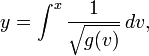
To be simple, if variance of X is function of mean, V(X)=g(u), where u is mean of variable X (e.g. u=E(X)), then the proper VST is:
For example, the Anscombe transform is to transform Poisson distribution (where u=v) to Gaussian distribution:

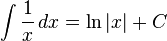
If V(X)=g(u)=u^2, then the integration of 1/x is log(x). 
That's what we usually used for microarray, RNAseq transformation. But do we test the V(X)=u^2 relationship?

We can test the homoskedasticity of residual by Breusch–Pagan testbptest {lmtest} is the R function. Here is the example output:
> library('lmtest')
> ## generate a regressor
> x <- rep(c(-1,1), 50)
> ## generate heteroskedastic and homoskedastic disturbances
> err1 <- rnorm(100, sd=rep(c(1,2), 50))
> err2 <- rnorm(100)
> ## generate a linear relationship
> y1 <- 1 + x + err1
> y2 <- 1 + x + err2
> ## perform Breusch-Pagan test
> bptest(y1 ~ x)
studentized Breusch-Pagan test
data:  y1 ~ x
BP = 15.867, df = 1, p-value = 6.795e-05
> bptest(y2 ~ x)
studentized Breusch-Pagan test
data:  y2 ~ x
BP = 7e-04, df = 1, p-value = 0.9784

y1 is significantly heteroskedastic, because the p-value is <0.05.

Sunday, April 29, 2012

Monday, October 10, 2011

k-mean clustering + heatmap


If you want more info about clustering, I have another post about "Clustering analysis and its implementation in R". Here is the link:  
http://onetipperday.blogspot.com/2012/04/clustering-analysis-2.html
------------

Several R functions in this topic:

1. dist(X)  -- calculate the distance of rows of data matrix X. The default distance method is euclidean. It can be maximal, manhattan, binary etc.

> a=matrix(sample(9),nrow=3)
> a
     [,1] [,2] [,3]
[1,]    5    2    9
[2,]    8    7    1
[3,]    6    4    3
> dist(a, diag=T, method='max')
  1 2 3
1 0    
2 8 0  
3 6 3 0
 
> dist(a, diag=T, method='euc')
         1        2        3
1 0.000000                  
2 9.899495 0.000000         
3 6.403124 4.123106 0.000000
2. hclust(D)  -- hierarchical clustering of a distance/dissimilarity matrix (e.g output of dist function): join two most similar objects (based on similarity method) each time until there is one single cluster.

hclust(D) can be displayed in a tree format, using plot(hclust(D)), or plclust(hclust(D))

3. heatmap(X, distfun = dist, hclustfun = hclust, ...) -- display matrix of X and cluster rows/columns by distance and clustering method.

One enhanced version is heatmap.2, which has more functions. For example, you can use
  • key, symkey etc. for legend, 
  • "col=heat.colors(16)" or "col='greenred', breaks=16" to specify colors of image
  • cellnote (text matrix with same dim), notecex, notecol for text in grid
  • colsep/rowsep to define blocks of separation, e.g. colsep=c(1,3,6,8) will display a white separator at columns of 1, 3, 6, 8 etc.
Both have 'ColSideColors/RowSideColors', a color vector with length of cols/rows. Here is an example(http://chromium.liacs.nl/R_users/20060207/Renee_graphs_and_others.pdf).

Another enhanced version is pheatmap, which produced pretty heatmap with additional options:
  • cellwidth/cellheight to set the size of cell
  • treeheight_row/treeheight_col: height of tree
  • annotation: a data.frame, each column is an annotation of columns of X. So, nrow(annotation)==ncol(X) 
  • legend/annotation_legend: whether to show legend
  • filename: save to file
4. kmeans(X, centers=k) -- partition points (actually rows of X matrix) into k clusters . For example:

# a 2-dimensional example
x <- rbind(matrix(rnorm(100, sd = 0.3), ncol = 2),
matrix(rnorm(100, mean = 1, sd = 0.3), ncol = 2))
colnames(x) <- c("x", "y")
(cl <- kmeans(x, 2))
plot(x, col = cl$cluster)
points(cl$centers, col = 1:2, pch = 8, cex=2)
The number of cluster can be determined by plot of sum of squares, eg. 

# Determine number of clusters
wss <- (nrow(x)-1)*sum(apply(x,2,var))
for (i in 2:20) wss[i] <- sum(kmeans(x,centers=i)$withinss)
plot(1:20, wss, type="b", xlab="Number of Clusters",ylab="Within groups sum of squares")
Using hclust and cutree can also set the number of clusters:

hc <- hclust(dist(x), "ward")
plot(hc) # the plot can also help to decide the # of clusters
memb <- cutree(hc, k = 2)
Note: kmean is using partition method to cluster, while hclust is to use hierarchical clustering method. Here is a series of nice lectures for this. A more detail for cluster can be found here: CRAN Task View: Cluster Analysis